65×24: a panoramic camera for iPhone

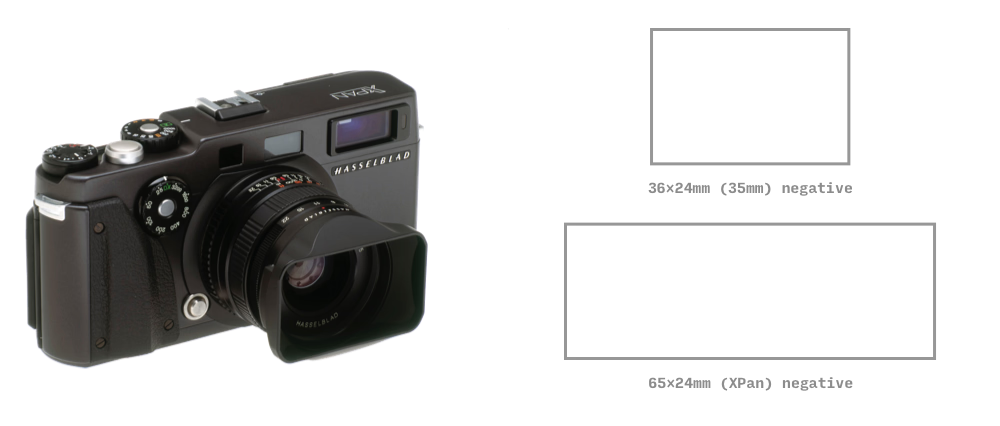
In 1998, Fujifilm and Hasselblad released a unique panoramic film camera, the XPan (TX1). Instead of 35mm long images on 24mm tall film, the XPan shoots 65mm long images, leading to the unique 65:24 aspect ratio.
 As a huge fan of this iconic camera and format, I wanted a similar shooting experience on my iPhone. This led me to build 65×24, a camera app for iPhone optimized for composing and capturing pictures in the 65:24 aspect ratio.
This page shares some insights from the design process. If you haven't tried the app yet, download it for free from the App Store! Or watch this video overview to get an idea of what it's like.
Design Vision
Modern phones tend to have tall, narrow screens: it is a perfect match for the very panoramic 65:24 ratio, and I wanted the viewfinder to occupy as much space as possible. It was tempting to occupy the full landscape width, but controls at the top/bottom would be awkward to operate, so I kept a strip at the right side for the various buttons. When shooting panoramic, it's extremely important to be able to check the edges of your composition, and for this reason I also didn't want the viewfinder to be visually obstructed by any controls.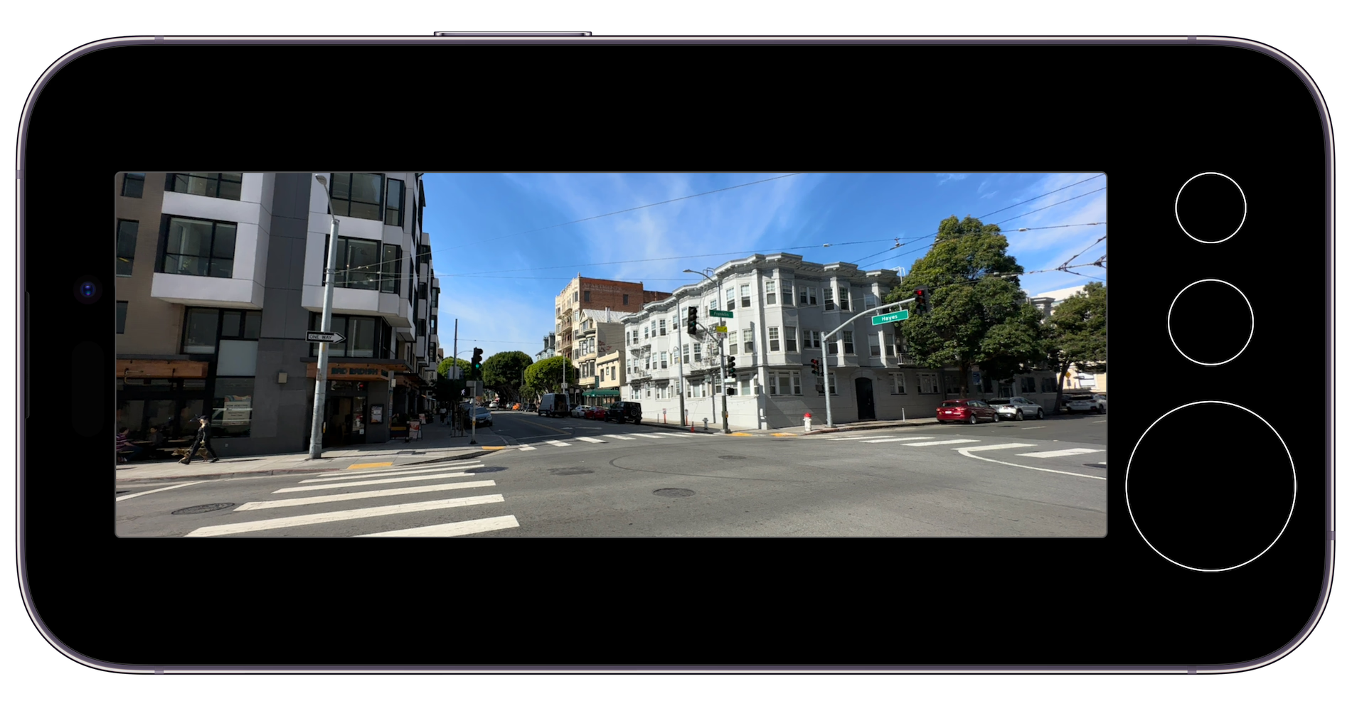
Here's one of the first prototypes I built, with placeholder circles for the controls. This was a functional app: when prototyping cameras, I find it essential to have a live viewfinder and functional capture, to test the interface on a physical device, in real world conditions. This let me quickly validate that a panoramic viewfinder with a small side area for controls was indeed a design worth pursuing.
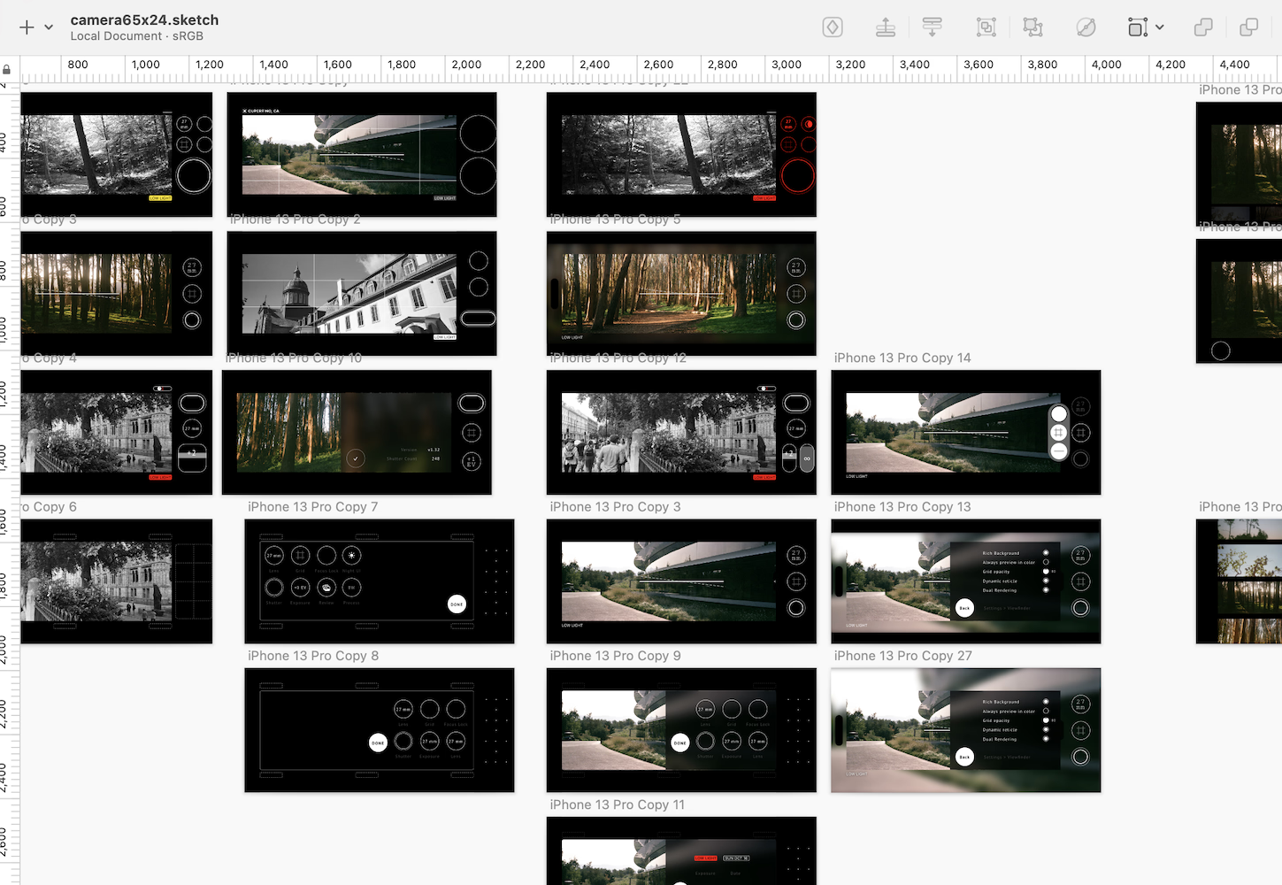
Once I figured that this early prototype had a strong foundation, I started sketching out a range of directions that built on top of this basic UI layout. There are lots of ideas in there about camera interfaces, many of them incompatible or conflicting with each other. Some of the ones that I couldn't make work for 65×24 I am excited to bring forward in future projects.
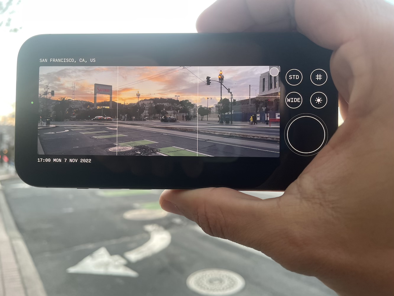
A slightly more refined build from a few weeks later. Controls are labeled (and the shutter button now looks more distinct), there's information displayed at the viewfinder periphery, and a grid overlay for composition. The small button in the upper right corner of the viewfinder brought up the Settings menu, but it didn't feel very visible, and I wanted the viewfinder to remain entirely free of control overlays, so I later switched to having a dedicated Menu button.
This prototype also taught me that "STD" is a terrible 3-letter shortcode to use for "Standard" (the button would cycle through various processing options; this got replaced by the Processing menu).
Designing the Menu System
The top level interface for 65×24 is purposefully very straightforward, to keep the shooting experience focused and uncluttered. At the same time, a large number of customization and processing options are available for advanced users. I wanted all of those settings to be out of the way, but also accessible and modifiable in a few taps.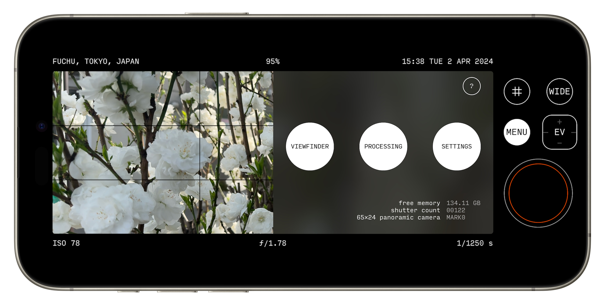
This is the menu that appears when pressing the MENU button. A few key things about the design of this menu system is that the capture controls remain fully accessible, and don't fully mask the viewfinder. The menu can be dismissed in a single swipe/tap, and it doesn't lose its place when closed and re-opened. This means that even while you're deep in settings, you can still use the camera and won't miss a great shot.
I also included some useful information, like the app version and free memory available. A fun detail is a lifetime shutter count, inspired by my Fuji G617's roll counter.
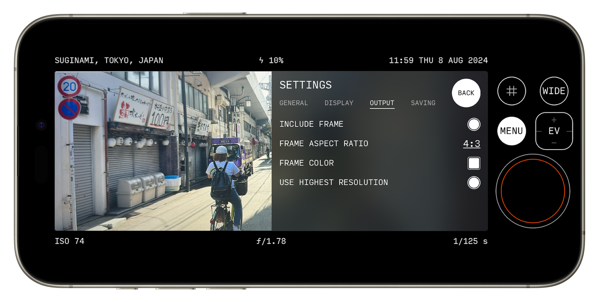
One of the 3 submenus is the Settings menu. Its straightforward list design is based on that of dedicated pro cameras, meant to be familiar to photographers.
The various settings are divided into themed tabs, displayed in a 2-column (setting, value) layout. Dedicated widgets (eg toggle, textual picker) let one quickly cycle through the options.
I did a couple things to keep navigation clear:
⋅ All pages in the menu system are designed to be only one level deep (tapping Back will always bring you to the top level menu). This keeps navigation zippy.
⋅ All settings for a given page are visible at once. It was tempting to make the menu scrollable to accomodate more options, but I found it compelling for all settings to be visible in one glance. This added some constraints when designing the menu, but I've been able to make it work so far. The layout is only an issue on the very first iPhone SE (which 65×24 still runs on, despite some text being cutoff) and its now minuscule 568×320 resolution. The next step up after that is 667×375 (iPhone 6/7/8/SE 2nd gen), which is enough space to work with.
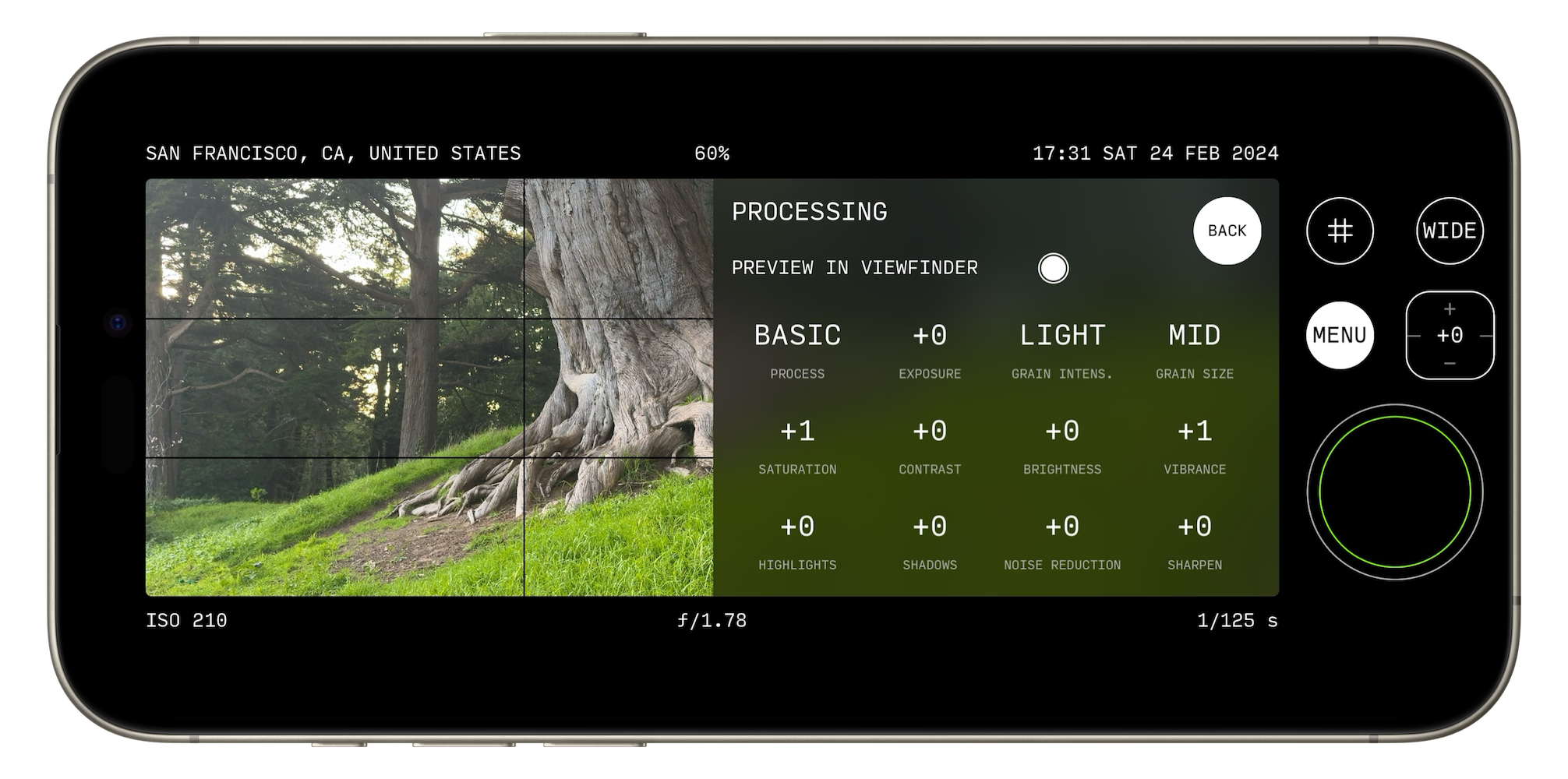
Another of the 3 submenus is Processing, designed to make it really easy to capture shots that look just like you want straight out of camera, saving on edit time. The various parameters can be tapped to step between values, or a press and swipe lets you quickly scroll through them.
There were 2 main principles I had in mind while designing this screen:
⋅ All parameters are visible at a glance, with the values being displayed prominently. If you like a particular configuration, a screenshot is all that's needed to save it for future reference. Or you can show it to a friend, and they can take a picture of it for their own use.
⋅ Values can be modified while observing live results in the viewfinder. This lets the photographer quickly dial in a visual look they like - unlike on cameras where the menu takes over the whole viewfinder.