PHOTO TOOLS
A collection of software field tools for photography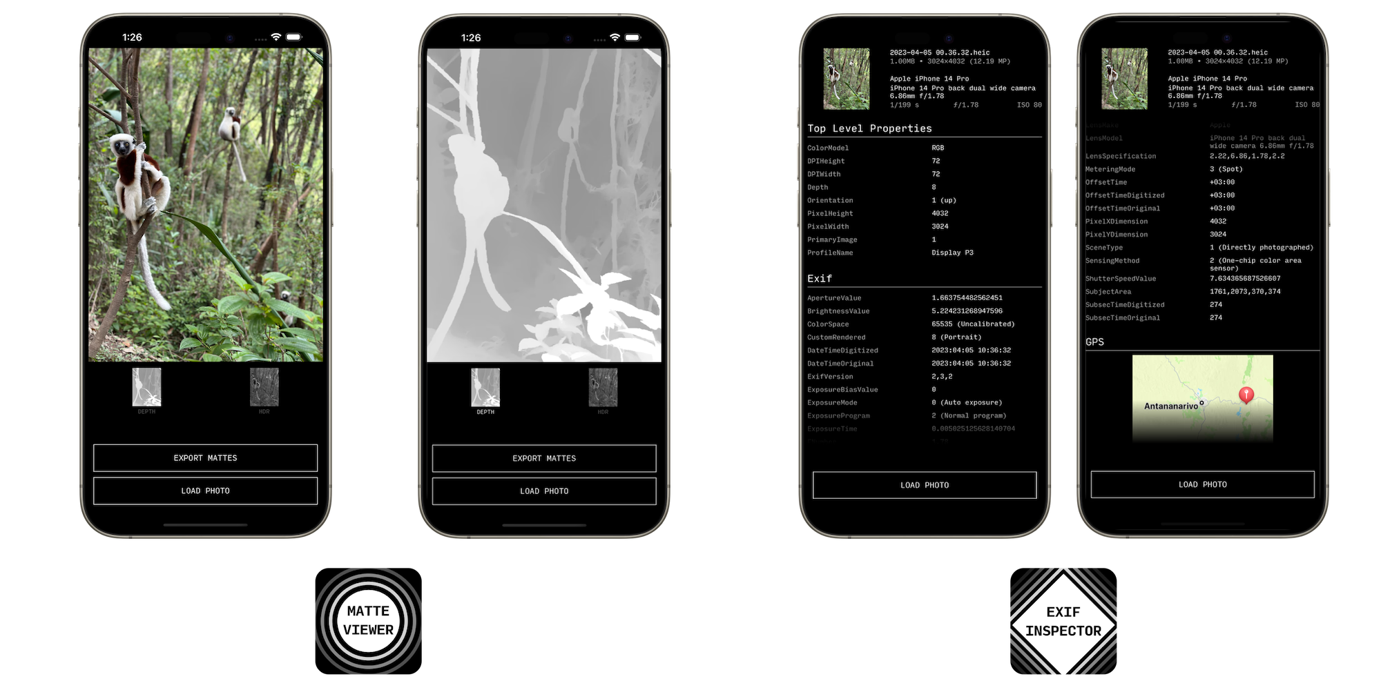
As a photographer, I use a wide variety of cameras and computers for photography. But by far the one I use the most is my phone. To that end, I've built a number of small apps to support my photography workflows.
Those apps all share a visual and interaction design system, and a common philosophy: small tools that do one thing, do it really well, load really fast, get out of the way, and fit easily within broader workflows. They're designed for small screens, but scale nicely to larger devices.
DESIGN SYSTEM
Visual Design
First and foremost, the color palette. I went for white-on-black for several reasons: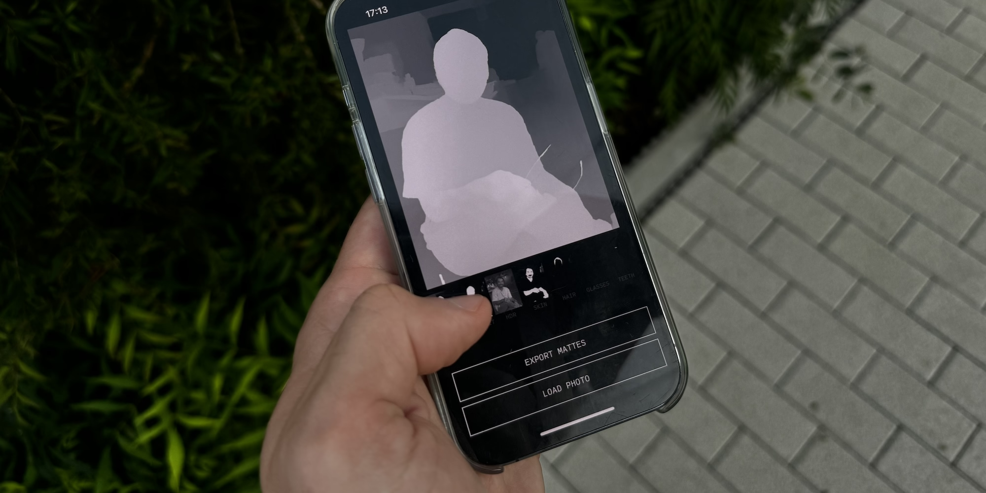
⋅ For photography focused tools, a black background ensures that there is no luminosity competing with the images being viewed.
⋅ In low light situations, a black background ensures no visual strain. There's nothing worse than having your eyeballs blasted with light when launching an app during a night shoot.
⋅ Most modern devices use OLED screens. On OLED screens, black pixels don't emit any light at all, unlike on traditional LCDs. This means pure blacks, but also less battery drain and better thermals. It might not be much, but when using camera apps that use a lot of battery and get the phone quite warm, everything matters.
☉
Regarding the typography, I chose a monospaced typeface - Input Mono - for its clear legibility, particularly important when it comes to pro tools. Information displayed by technical readouts often includes strings of numbers or hard to memorize codes - so every character being distinct, placed in a regular fashion is essential to maintain clarity.
In camera user interfaces, monospaced fonts are particularly a good fit for numerical indicators that update frequently, as flexible width numbers cause a distracting change in text length on every update.
Interface Design
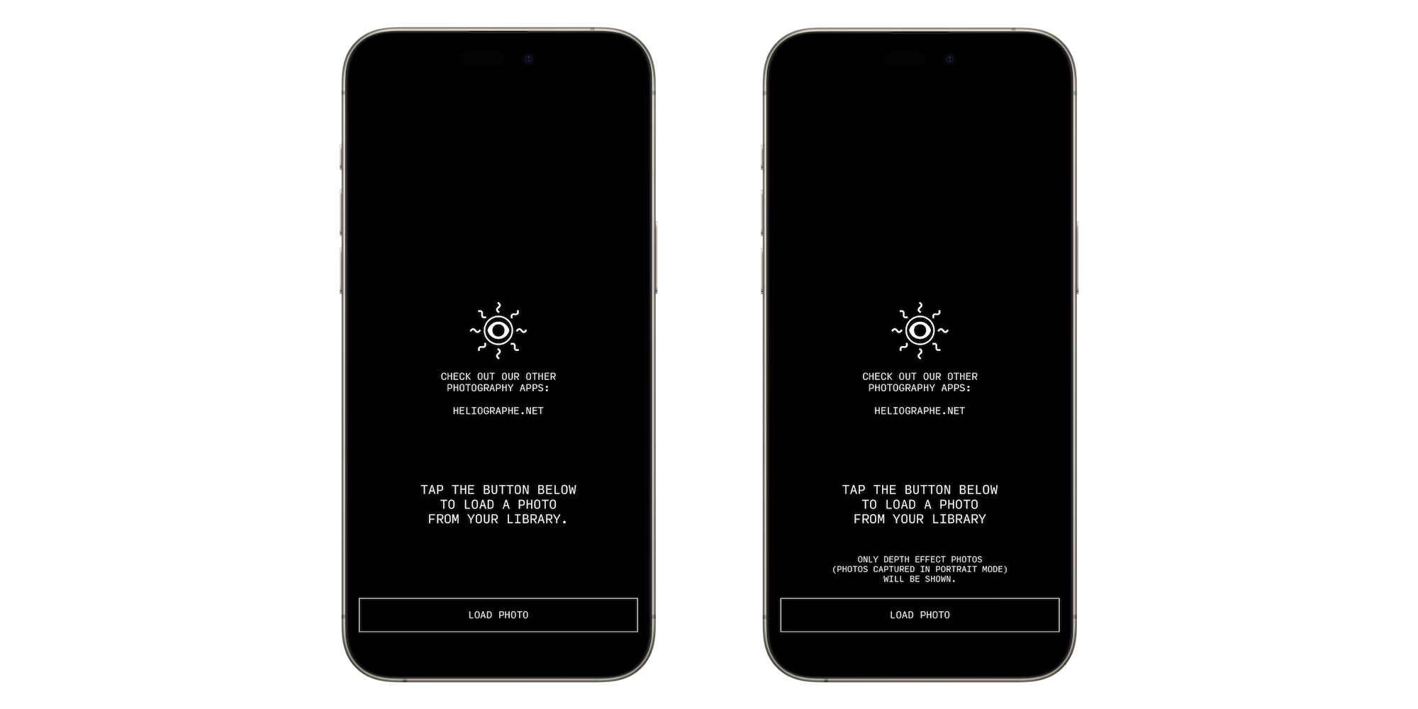
All apps present a similar screen when first being launched: the Héliographe logo, encouraging users to check out our other apps (all the Photo Tools are free!). A short description of what the app to do, for first time users. And a button for the main action. The focus is on providing a clear, lightning fast tool - no onboarding that nags the user for many screens, no intrusive tooltips.
All the tools are built in a screen-size agnostic way, which lets them run on iPhone, iPad, Mac, and Vision Pro.
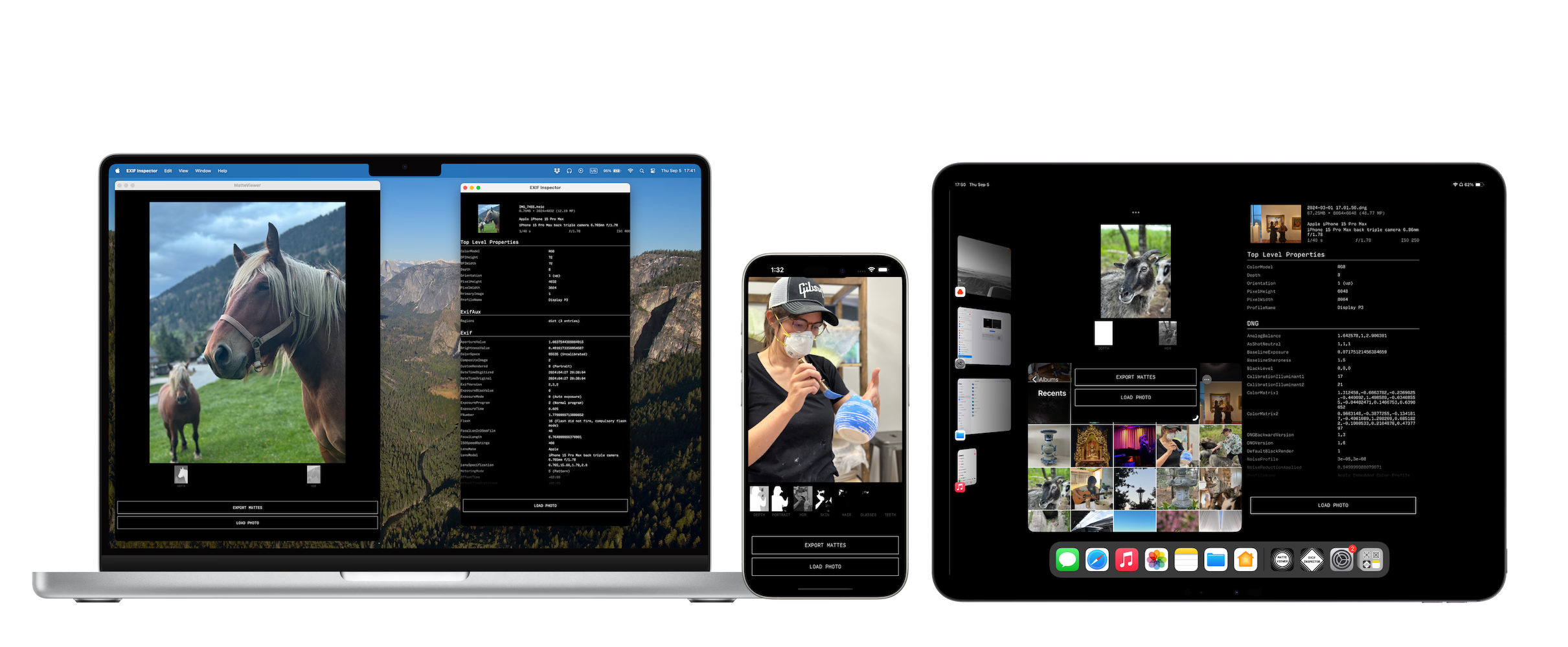
EXIF INSPECTOR
Released April 2024
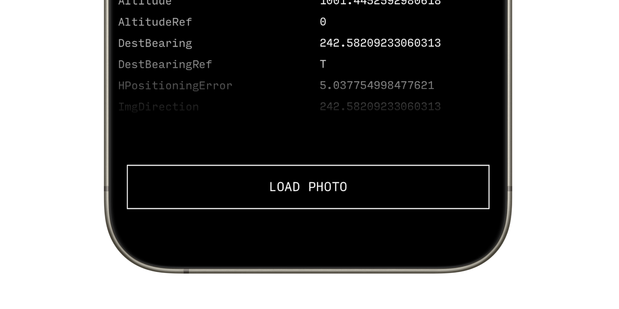
This app lets you review full EXIF metadata with an information dense display that can be summoned straight from the Photos app.
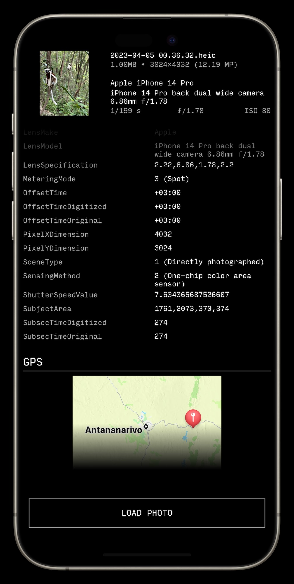
This is the second photo tools app I built. I wanted a quick way to view a photo's full EXIF metadata, in an information dense interface that loads as fast as possible (many free EXIF viewer apps are bloated with ads and tracking).
The app is built for pros in mind: the entire metadata is displayed in a single list, so it's really quick to jump around. When numerical values have semantic associations (eg 1 = Up for the Orientation field), they are included in the readout. Tapping any value lets one copy them to the clipboard.
To support quickly viewing metadata, EXIF Inspector can be summoned from the stock Photos app (the app works the same way standalone, or called from its Share Sheet extension).
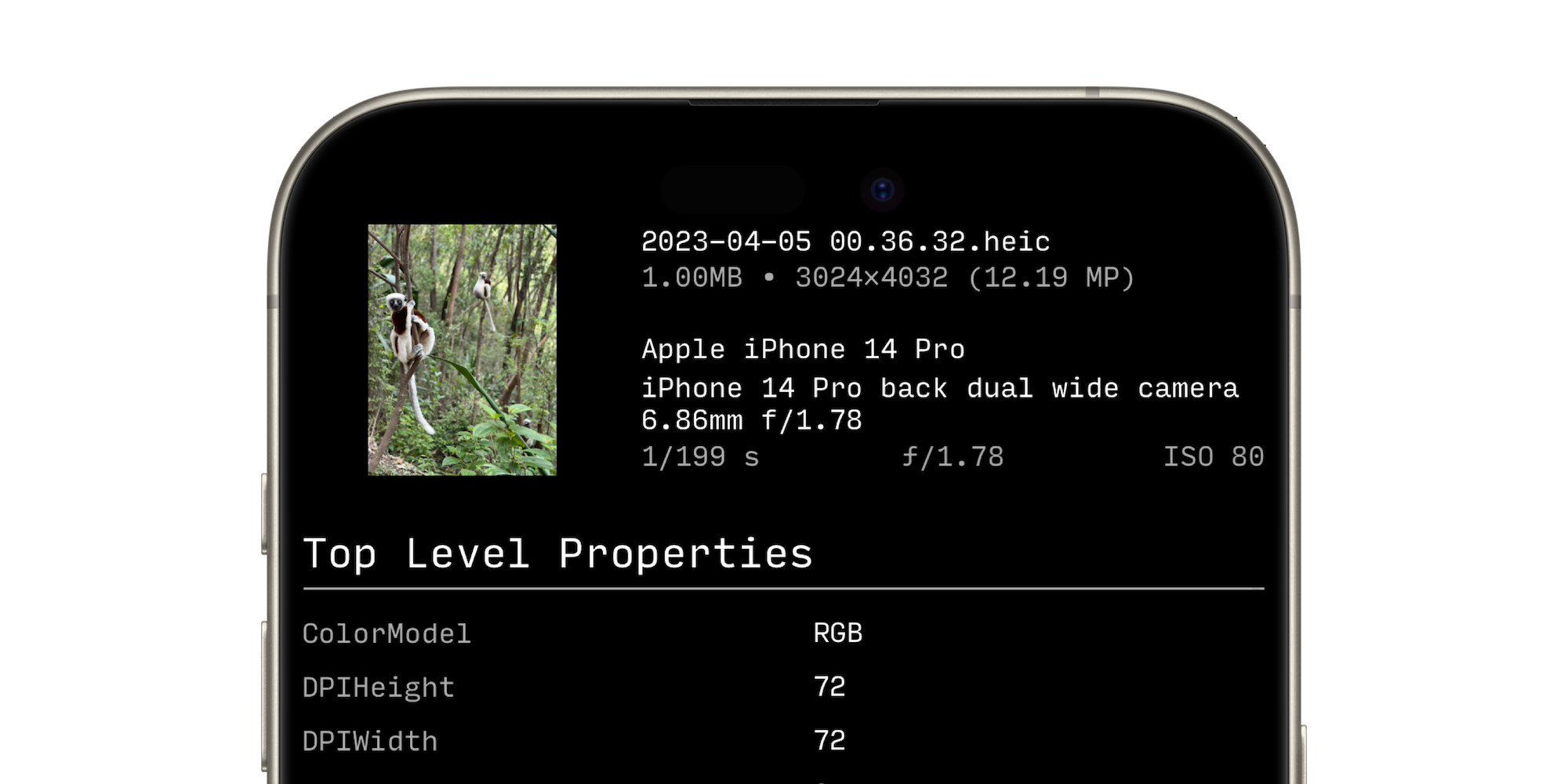
There is a sticky header that features a thumbnail of the photo, as well as an overview of the EXIF information a photographer's most likely to be interested in. This way, you never lose essential information about the shot (resolution, shutter speed, etc) even when deep into the data.
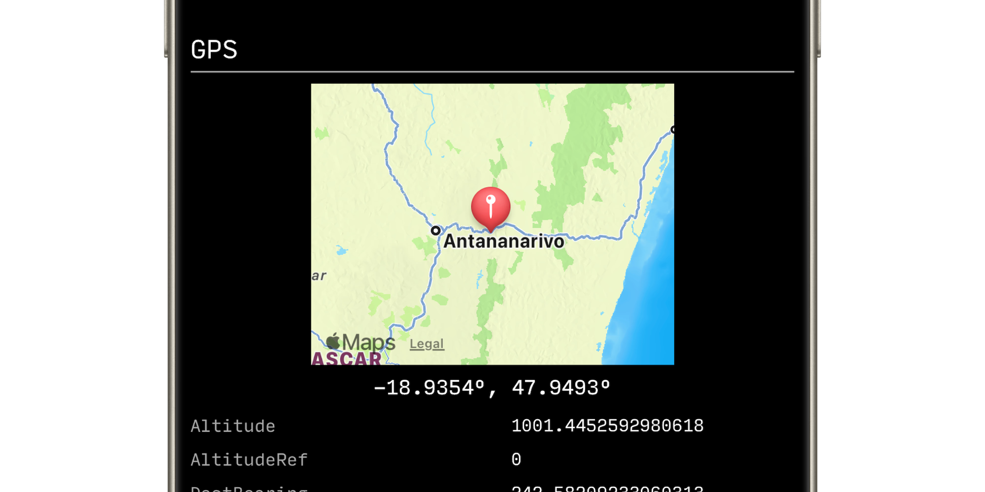
For the GPS section, if there's one, a small map preview is embedded right under the title. It provides just enough of an additional layer of visualization to give context to the otherwise hard to decipher GPS data.
 One challenge with flat text-heavy interfaces is indicating scroll areas, or where there is additional off-screen content. I solve this problem here by using a transparent gradient at the top and bottom of the scroll view that gently signals the continuing content.
MATTE VIEWER
Released January 2024
Your iPhone captures and generates all sorts of interesting depth matte and semantic map data when you capture Portrait photos (integrated into the main Photo mode starting iPhone 15 Pro). This app lets you view and export those maps. You can use them for post processing, or creating visual effects in tools such as Photoshop, Cinema4D, Touch Designer, etc.
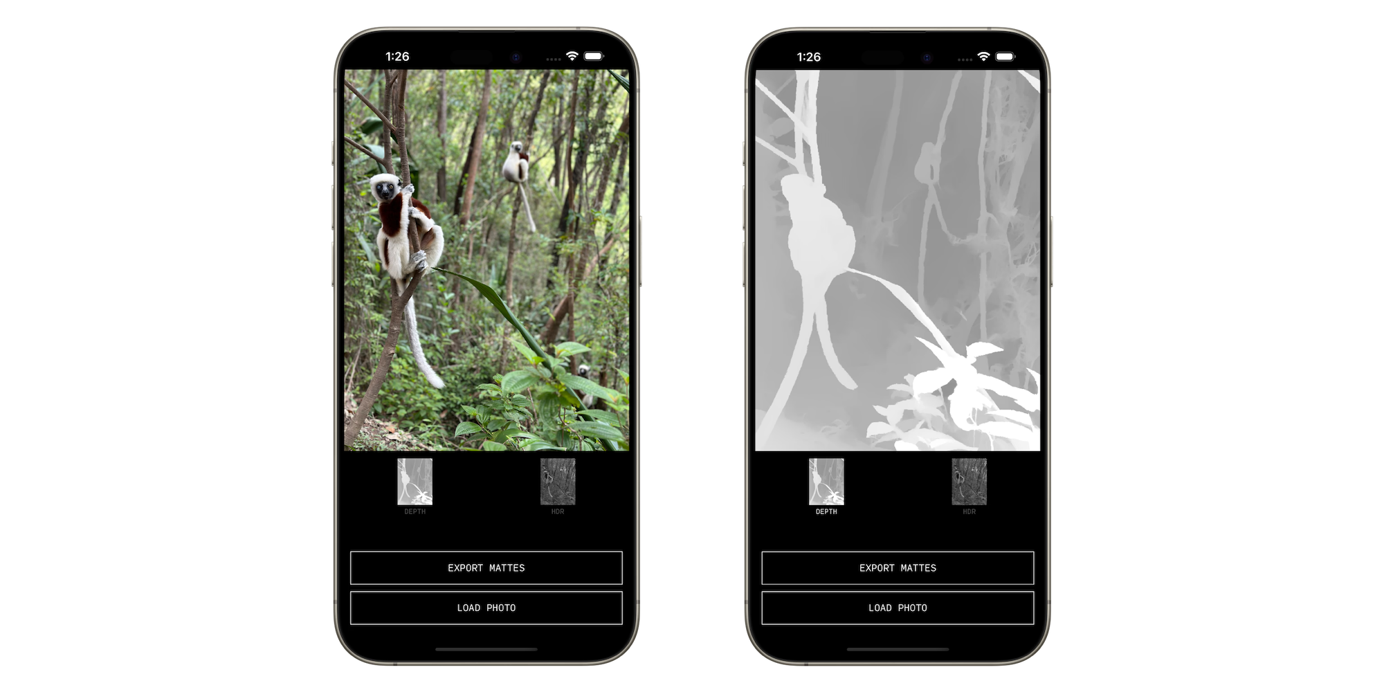
Matte Viewer is the first tool I shipped. At first, I just wanted a quick way to view depth mattes from Portrait photos captured on my phone. Modern phones generate a number of semantic maps in addition to the main depth map, so I expanded the UI to include those as well.
In order to quickly compare the main photo with its maps, the interface is implemented as thumbnail buttons that momentarily display the image full screen when held down. The original image reappears when released. This makes it easy to quickly toggle between a matte and the main image, to identify edge inaccuracies and so on.