Trichromy
a trichromatic camera app, for iPhone.
In 2015, I read about Sergei Prokudin's early 1900s color photography work documenting the Russian Empire. He notably did this without color film. How? By shooting three black and white photos, one through a red filter, one through a green filter, and one through a blue filter, and then recombining them through a special viewer. This is the trichromatic process.
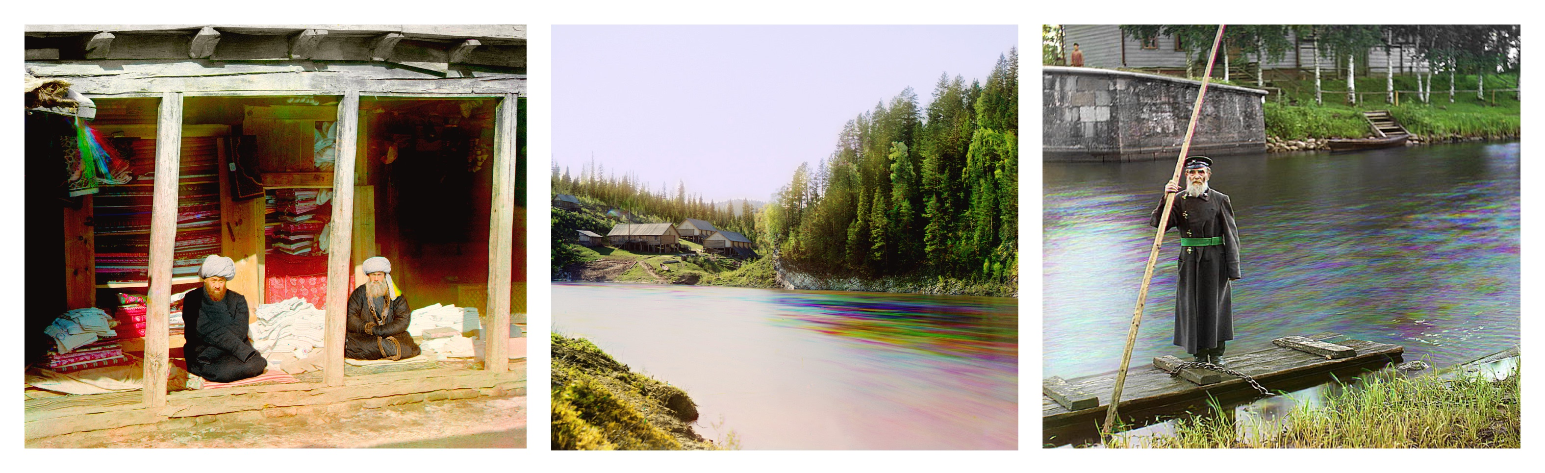
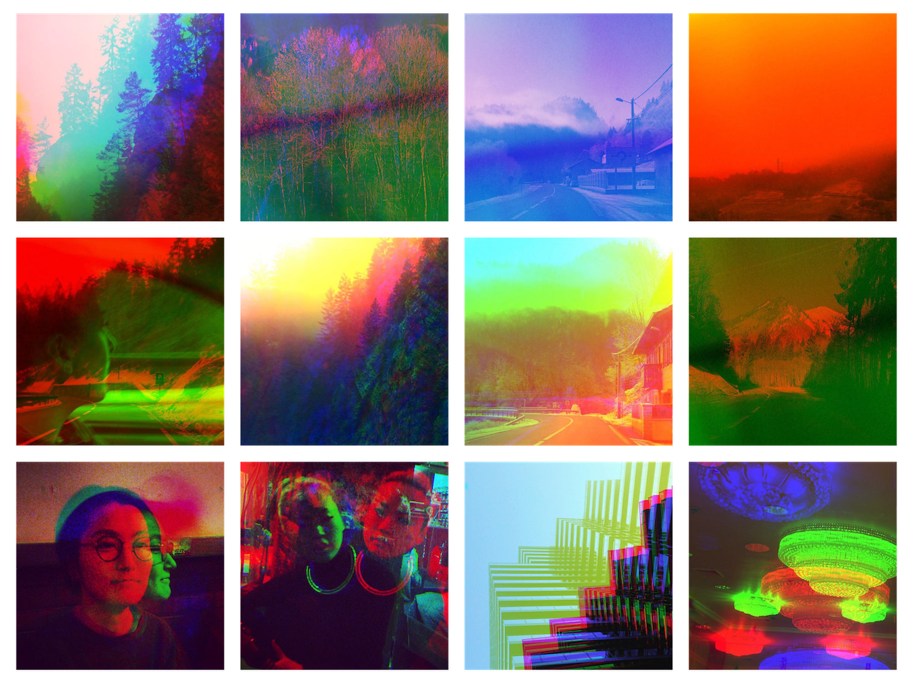
While the goal is to obtain a perfectly aligned color image, any camera or movement of the subject and background in between the frames will produce visual artefacts, which range from barely perceptible to phantomatic distortions of the image.
In a way the trichromatic photo is an optical illusion: it is three images, taken at three separate points in time, pretending to be a single frame. The more apart in space or time the three shots are, the more the photograph is revealed for the composite it really is, creating a new visual aesthetic in the process.
First Prototype
I fell in love with this method of constructing images, and thought it would be really fun to recreate the process as an app for my iPhone, so I put together a first prototype over a few days of vacation spent at my grandparents' house.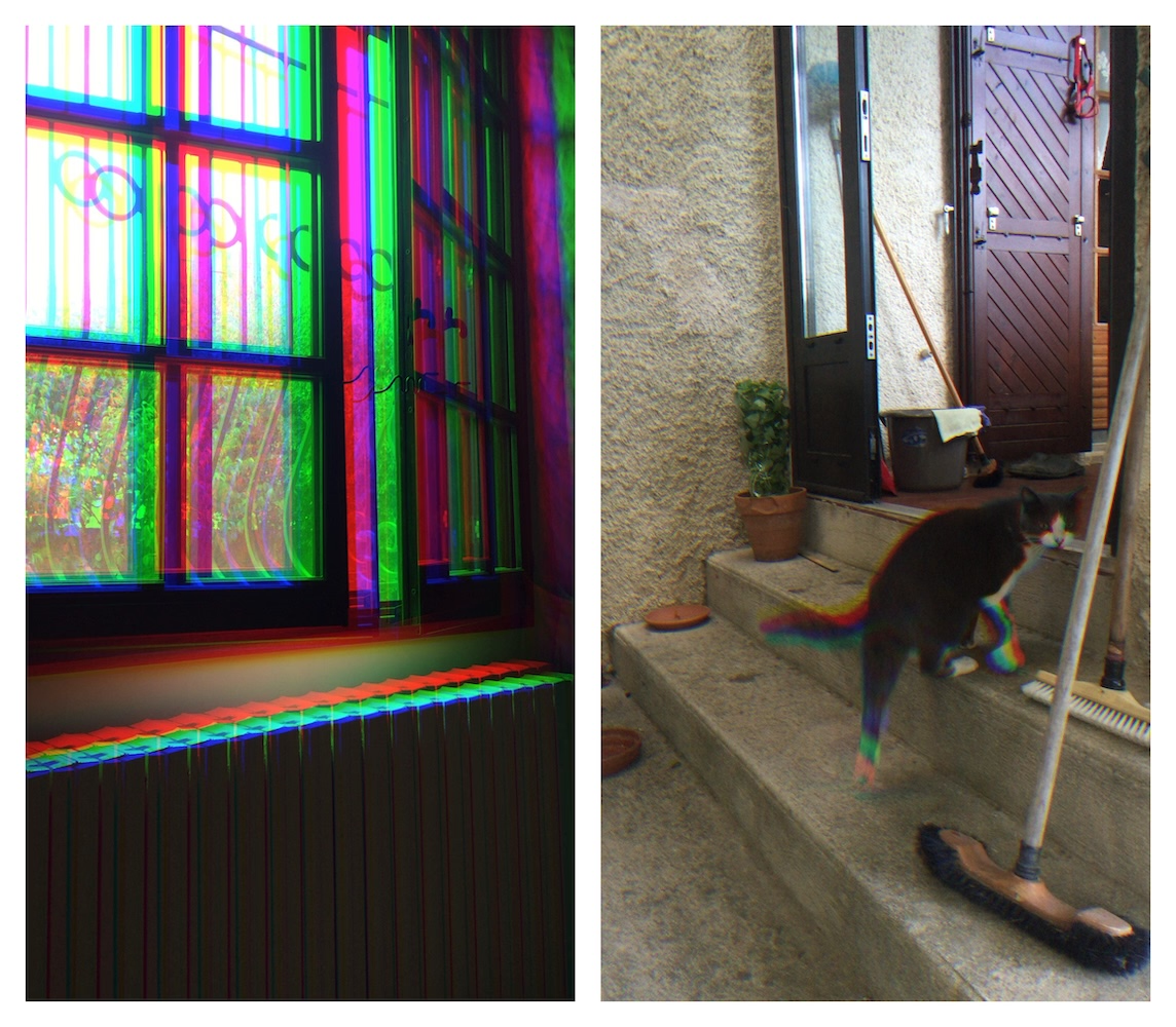
Some of the first pictures ever taken with Trichromy.
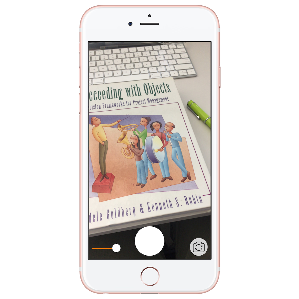
This first version had just the bare minimum UI and features. The capture screen consisted of a slider to adjust the timing between a frames, a button to toggle between the front/rear cameras, and a main shutter button.
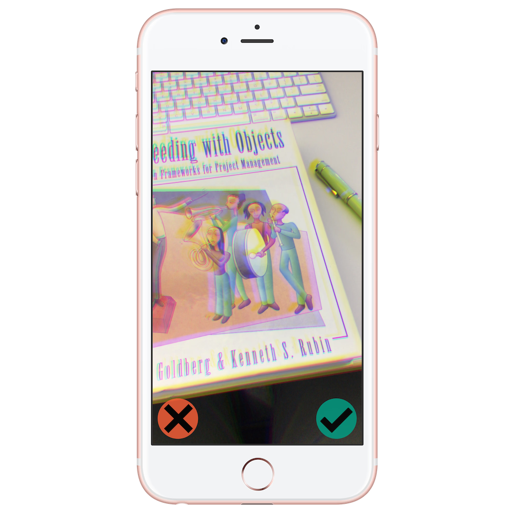
When a shot is taken, a review screen with Discard/Save buttons appears. This is an unusual choice, as most camera apps will save the image and let the photographer capture images uninterrupted. However, due to the experimental - and sometimes unpredictable - nature of the process, it felt right to present the result for immediate review.
I couldn't release the app commercially due to my employment situation at the time, so didn't spend too much time on it beyond the initial prototype - but it was installed on friends' phones, and many shots were taken with it over the years. Children seem to particularly enjoy its playful, toy-like properties.
Redesign & Release
In 2023, I decided to fully redesign Trichromy and give it a proper release. I did keep the same app icon, as it had grown on me over all those years.
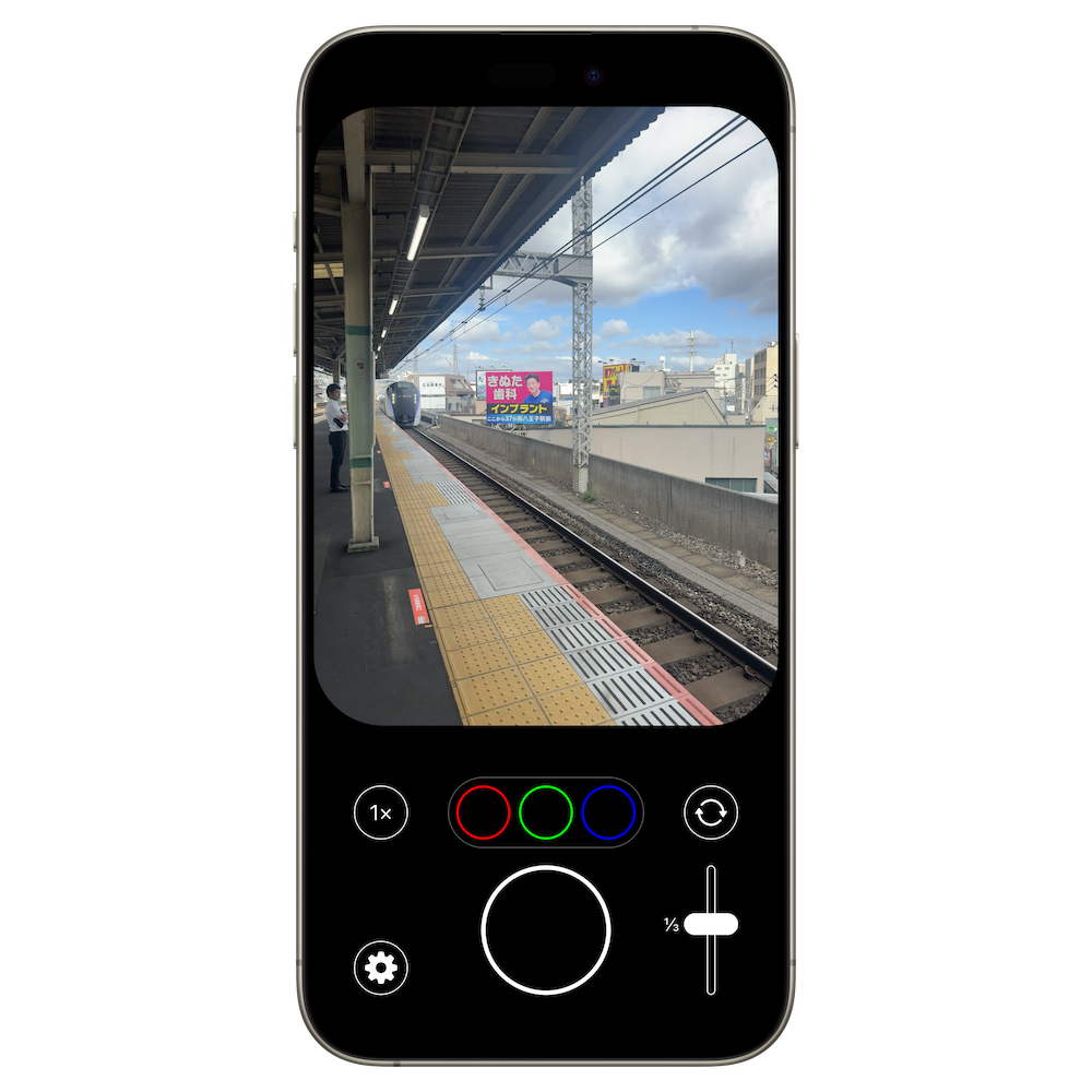
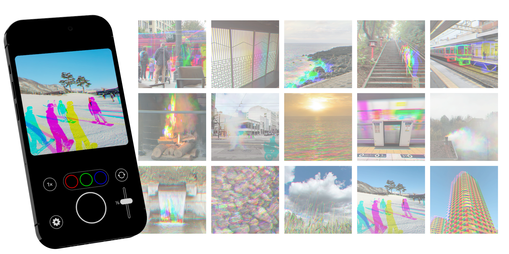
The iPhone had changed a fair bit as a platform since my first prototype, and so the user interface needed to be rethought from the ground up. Rather than filling the entire screen with the viewfinder, as in the original prototype, with controls overlaid, this time I chose to fit the 4:3 sensor preview within the display, keeping the bottom area for the individual controls such as the shutter and camera picker. This means the entire viewfinder can be monitored while you use the controls, and operating the interface does not interfere with your previsualization of the scene.

An addition to the new version were the individual color channel shutters, above the main shutter button, which enable the capture of color channels in any order, with any timing. This greatly enhances the flexibility of Trichromy as a tool for experimental photography.
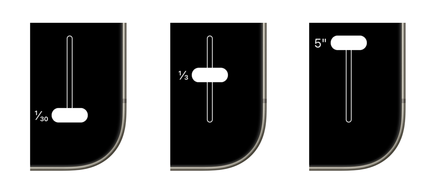
It was also quite clear that the slider needed to be designed with consideration, beyond what the stock iOS slider used in the original prototype could offer. The handle was made larger, to ensure no misses when adjusting it quickly while shooting. Rather than a continuous slider, offering hard to distinguish levels of frame separation, the new slider was given a smaller set of values that made sense based on long term use of the app. The currently selected time interval is clearly displayed through a label, and haptic feedback triggers upon step changes.
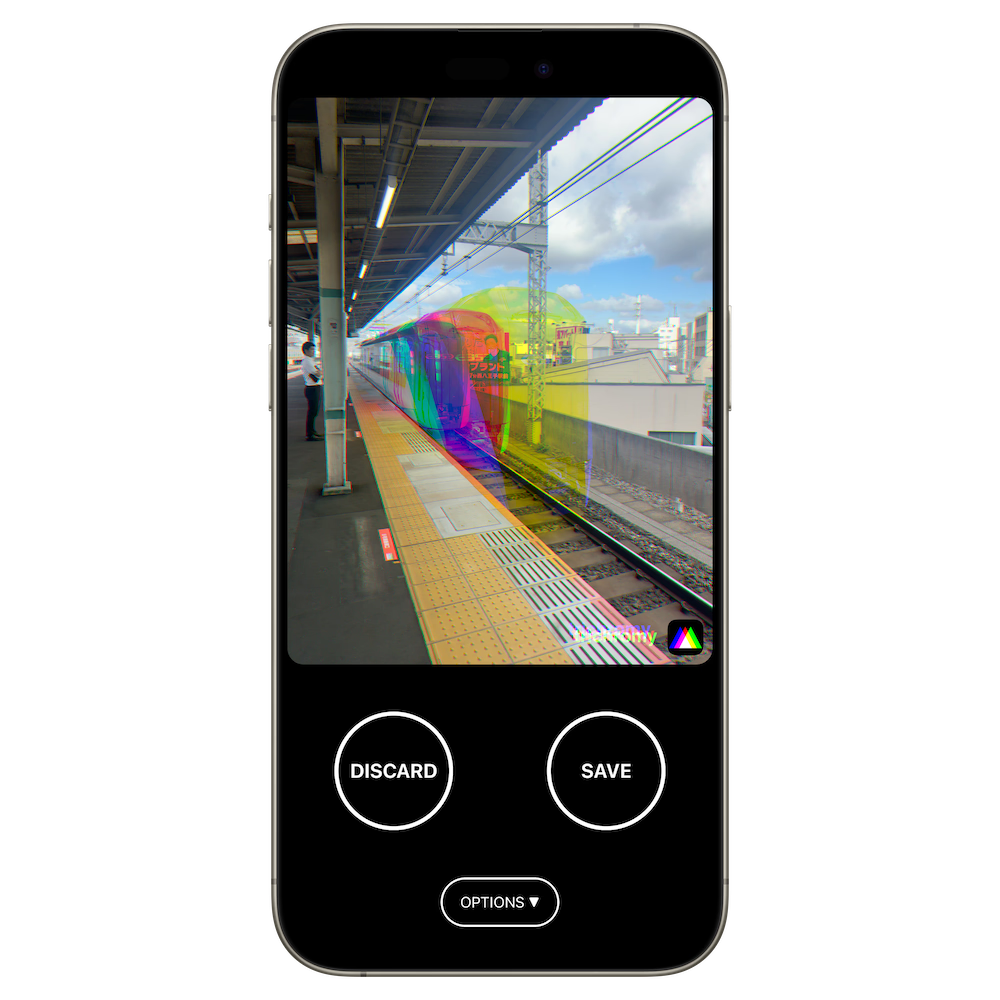
The shot review screen was redesigned for the new layout, and to use text that explicitly states what the buttons do instead of icons. This redesign of the app also includes a new Options menu.
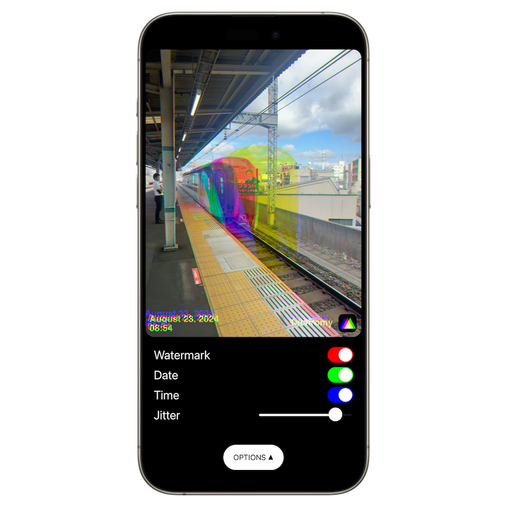
The Options menu offers various optional overlays for the final image. A watermark of the app's icon was a feature requested from some users, as it makes it clear how the image was made, for example when sharing on social media. Date/Location can also be displayed, with an adjustable text effect that echoes trichromatic spacing.
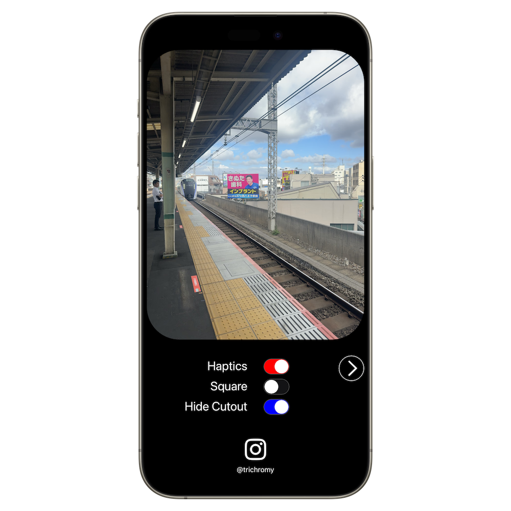
A Settings menu lets you turn off haptics, show/hide the notch/Dynamic Island (if your phone has such a cutout), and switch between 4:3 (native sensor) and square aspect ratios.
Go to trichromy.net for more about Trichromy.
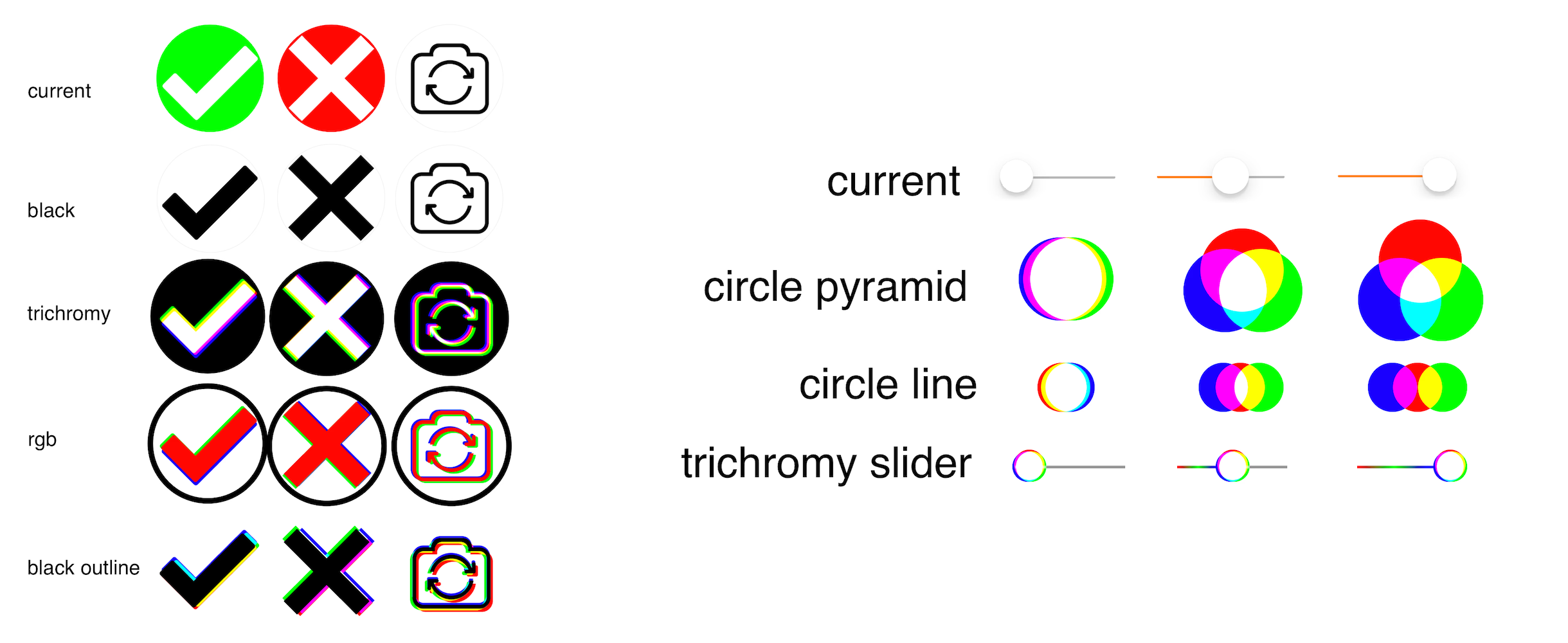
Bonus: Icon Variations
Here are some directions I explored when coming up with Trichromy's icon, back in 2015.Bonus: UI Explorations
The idea was to use the iPhone's gyroscope to animate the various UI elements with trichromatic separation, inspired by a similar effect in iOS 6.I ended up dropping this direction, as it was hard to strike a balance between the effect being noticeable enough to be interesting, yet not distracting as you used the app. In addition, the animation had to run at screen refresh rate to appear smooth, creating a GPU overhead that wasn't justified in an already resource-constrained camera app, particularly on the iPhone 6 hardware.
This idea did inspire the "jitter" aspect of the output overlays in the current version of the app.